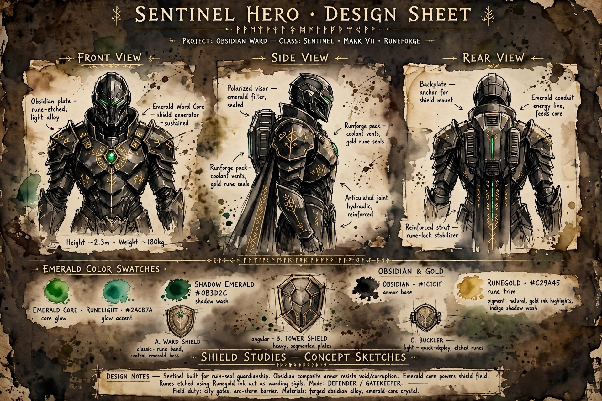
Hero Design
Why the Guardian looks the way the Guardian does — a design breakdown of the fictional sentinel.
Design analysis of a fictional character concept. All lore is invented for this fan reference.
The silhouette test
A good hero design survives being reduced to a black shape — and the Guardian’s is built for exactly that. The silhouette reads in three strokes: tall oval shield, broad pauldrons, T-slit helm. Even at thumbnail size, even in fog, even half-lost in a nebula, those three shapes say the same thing: the wall is here.
The design brief the original concept answers is simple: this is not a hero who attacks. Every aggressive hero design leans forward — blades, claws, motion lines. The Guardian’s silhouette is vertical and planted. The shield is not a weapon held at the ready; it is a position. That single choice separates the Guardian from every other armored hero in the Vizlings lineup.
The color logic
Three colors, three meanings, no exceptions anywhere in the concept:
- Obsidian black — the armor. It absorbs light the way the Guardian absorbs damage. It is also the color of the dead world of the First Vigil: the sentinel wears the color of what they failed to save, so they never forget it.
- Emerald green — the energy. The Surge’s color is life, growth, the Beacon-Keepers’ signal fires. Green is the color of what is being protected, worn on the protector.
- Ancient gold — the runes. Gold is memory: the Oath, the fallen Wardens, the eleven reforgings. Nothing gold on the Guardian is decoration. Every rune is a word of the Oath, and the Oath is the design’s thesis statement.
The helm
The T-slit helm is the design’s bravest decision. Most hero designs show a face — the audience needs eyes to trust. The Guardian’s design refuses, and trusts the audience to trust the posture instead. The emerald glow behind the slit is not a face; it is a lamp in a tower. It says: someone is on watch.
The design in motion
Static, the Guardian is a wall. In motion, the design tells a subtler story: the sentinel advances only to interpose, never to pursue. The shield-bash forms are all counters and deflections; the Wave — the one offensive surge form — is framed in the lore as a failure state, a wall unmade. Even the emerald energy reads as weather rather than weaponry: it drifts, pools, and shelters. The design’s kinetic thesis is that the Guardian’s violence is always reactive geometry — the shortest path between a threat and a ward, occupied by a shield.
The palette as promise
Obsidian, emerald, gold — the design never breaks the assignment. New artists sometimes ask why the Guardian can’t have a crimson cloak or silver trim “for variety.” The in-world answer is that every color is spoken for: obsidian is the dead world, emerald is the living one, gold is the Oath between them. The out-of-world answer is the same, minus the lore: the constraint is the character. A hero defined by keeping promises doesn’t change colors on a whim.
What the design teaches
The Guardian’s visual design is a thesis: protection is a posture, not an action. The shield is raised before the fight starts. The stance is taken before the enemy arrives. Everything about the design — the planted feet, the forward shield, the watchful helm — communicates that the Guardian’s job began before the battle and continues after it. The design never shows the Guardian striking first, because the design knows the Guardian never does.
Source notes
Design analysis of a fictional character concept for the Vizlings “star team guardian.” All lore and design reading are original editorial work for this fan reference. Images are AI-generated dramatization art — no real people.