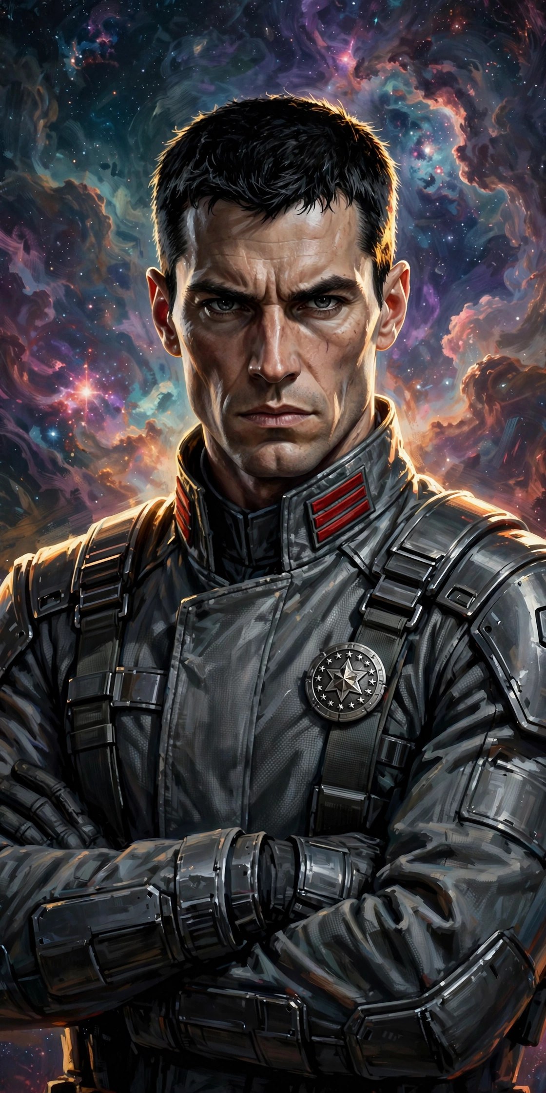
Hero Design
Why the Fleet Admiral works as a character — a design breakdown of the tactician archetype.
The archetype
Aeron Skyrift is built on one of fiction’s most reliable archetypes: the officer-strategist — the character who wins before the battle starts. Think of the role, not any specific predecessor: the calm center of the command deck, the plan behind the heroics. The design works because it commits fully to the archetype’s promise. He doesn’t have a secret tragic brawl-mode; he has a map room, and the map room is enough.
What distinguishes him within the archetype is where the drama comes from. Strategist characters often risk becoming exposition machines — the person who explains the plan while others execute it. Aeron’s design solves this by giving the strategy personal cost: the Veyra Evacuation, the countermanded order, the court-martial. His plans aren’t cleverness for its own sake; they’re the mechanism by which he carries responsibility for other people’s lives. That’s the engine of the character.
Visual language
The design communicates rank and restraint before a word is spoken:
- Gunmetal grey — the color of warship hulls. He dresses like the fleet he commands: functional, unadorned, serious.
- Signal red chevrons — the single vivid accent. Red is the color of warnings, of running lights, of things that demand attention. On Aeron it says: this person is in charge, and you should listen.
- Sharp geometry — angular features, a crisp uniform cut, the chevron motif repeated in the insignia. Nothing soft, nothing wasted. The design has no decorative elements that don’t also communicate.
- Stillness — in every generated portrait he is composed: arms crossed, hands steepled, standing at parade rest. The character’s power pose is not moving. That’s deliberate. Anyone can look dangerous mid-explosion; Aeron looks dangerous doing nothing, which is scarier.
The name
“Aeron” reads as both classical and severe — it has the ring of old military history without belonging to any specific tradition. “Skyrift” does the heavy lifting: sky for the theater he fights in, rift for what he opens in enemy plans (and, in-universe, for the Rift Step). The callsign “Rift” compresses it into something a team can shout across a battlefield.
What the design avoids
Three common traps, all sidestepped:
- The tortured genius. Aeron is competent without being miserable about it. His trauma (Veyra) is present but doesn’t define his every scene.
- The rank-obsessed martinet. He introduces himself as “Rift, tactics,” designs his own insignia so junior officers can identify responsibility, and lets team members override his orders. Authority as service, not ego.
- The infallible planner. His plans fail — the lore includes setbacks, and Tactical Overwatch explicitly fails against true randomness. A strategist who never loses is boring; a strategist who loses well is compelling.
The design in one sentence
A man who turned “doing the homework” into a superpower, dressed like the warship he commands, carrying the weight of every life his plans touch.
The silhouette test
Character designers talk about the silhouette test: can you recognize the character from a blacked-out shape alone? Aeron passes it. The high collar, the squared shoulders, the chevron cluster at the throat — even in silhouette, he reads as officer. Compare him mentally to the rest of the StarTeam: Isla’s tool harness, Zyx’s pilot’s scarf, Hale’s bulk. Each silhouette tells you the role before the face tells you the person. That’s design doing its job.
Source notes
This design analysis discusses a fictional character from the Vizlings app; all lore referenced is fan-written world-building (see Methodology). The portrait on this page is AI-generated dramatization art.