Deep dive // Character design
Hero Design
How do you draw "body space suit hero" so it reads in three seconds? Silhouette first, orange second, face third. A fan analysis of the invented design.
The three-second read
Good hero design survives a thumbnail. Cass’s design is built around a three-beat read, in order:
- Silhouette: bulky, humanoid, unmistakably suited — wide shoulders, barrel torso (the PLSS backpack), slightly bow-legged stance of a pressure garment. Even in total silhouette he reads as “person in a spacesuit,” which is the entire app-card brief.
- Color: safety orange against graphite. Orange is the highest-visibility color in the fiction’s EVA doctrine — you wear it so the crew can find you — and it makes Cass instantly separable from any background, starfield or station interior alike.
- Face: helmet visor up, human face visible — short dark-brown hair, warm tan skin, confident grin. The design rule is strict: the audience must always be able to see him. A hero you can’t see isn’t a character; he’s equipment.
The suit as costume
The AEGIS Mark VII “Longhaul” is designed like workwear, not armor — because in the fiction, that’s what it is. Design details and what they communicate:
- Hard-shell torso, soft limbs: the barrel chest reads as protection; the flexible arms and legs read as a worker who moves. The contrast says “protected but active.”
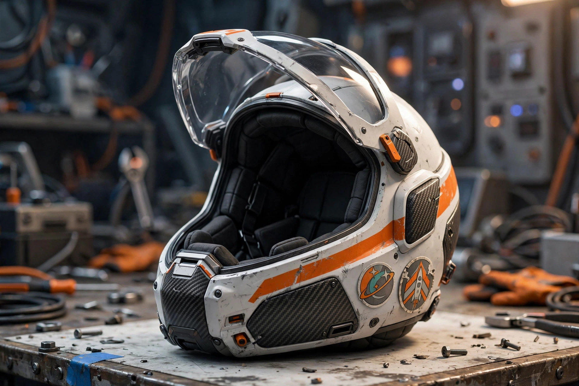
- Stenciled mission patches: each patch is a story the audience can almost read — the visual equivalent of scars. The design accumulates history instead of resetting it.
- The chest plate — “ARDEN · EVA-1”: name and designation, stenciled military-style. It tells you who he is and what he does in four characters.
- Orange/graphite split: orange on the torso, helmet stripe, and boots (the parts that must be seen); graphite on the limbs and backpack (the parts that take abuse). Form follows fictional function.
- The visor, always up (off-duty): on EVA the visor is down — physics — but in every character moment, it’s up. The design never hides the face when it has a choice.
Palette discipline
The site’s art holds a tight palette: safety orange (#d9531a neighborhood), graphite (#22262b), off-white, with starfield black and steel blue as environment colors. Nothing else gets to be loud. The discipline serves the fiction’s utilitarian theme — this is a working hero, and his colors are the colors of hazard markings and flight suits, not capes.
What the design refuses
The fan design bible for Cass has explicit don’ts, and they’re worth stating because they define him:
- No cape, no flourish. Anything that would snag in an airlock doesn’t exist.
- No faceless helmet shots as hero images. The visor-up rule.
- No pristine suits. The Longhaul is always a little scuffed — the fiction’s honesty is that vacuum is abrasive.
- No weapons as costume. Cass carries tools. The design treats a tether carabiner as his signature object the way other heroes treat a sword.
Evolution in the fiction
The lore gives the design a history: the rigger’s work suit at the Kestrel (SC 1204) — plain, borrowed, too big; the cadet EVA rig (SC 1206) — standard issue, forgettable; and then the first production Mark VII in SC 1207, which he never takes off, metaphorically speaking. The patches accumulate; the scuffs accumulate; the silhouette stays. The design tells you he’s been doing this a long time without a single line of exposition.
Source notes
- Design analysis is fan interpretation by this site’s writers; the character is fictional and the app’s official art direction is not public.
- Character identity anchor: Vizlings app card (StarTeam), card description “Body space suit hero.”
- All images on this site are AI-generated dramatization art; see
the image credits on this page.