Hero Design
Every choice in Niko's design serves one idea: patience made visible.
Honesty note: Niko Raal is a fictional character concept. This is a design analysis of invented lore — a fan’s reading of a fictional hero.
The core idea
Most StarTeam heroes are built to be seen — bright colors, big silhouettes, louder-than-life entrances. Niko Raal was designed as the counterweight: a hero built to be felt. His design brief, as reconstructed for this reference, reads like a dare: make the quietest person on the team the one nobody can ignore.
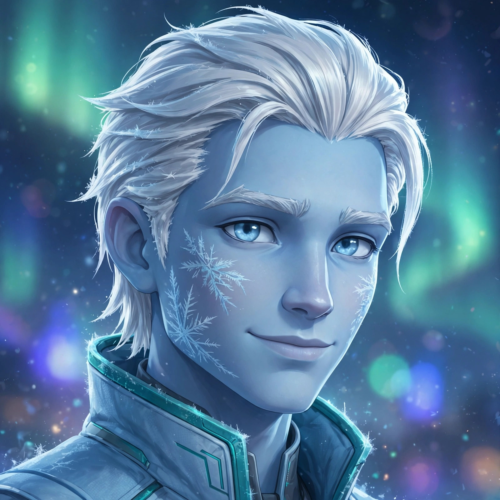
Everything about him serves patience made visible. The pale blue skin that seems carved from glacier ice. The frost-white hair that doesn’t move in a wind that moves everyone else’s. The stillness. When Niko enters a room, the design tells you before he speaks: this is someone who has already decided what happens next.
The silhouette
Niko’s silhouette is deliberately narrow and vertical — a blade, not a hammer. Where Bulwark is all shoulders and mass, Niko is a single clean line: long coat-like suit panels, close-fitted limbs, gauntlets that draw the eye to his hands. The read is precision. His body language in every depiction is economy — no wasted motion, hands usually still, the stillness of someone conserving something.
The color story
His palette is a thesis statement:
- Ice-blue (the suit, the skin’s undertone): cold as identity, not costume. This is who he is, not what he wears.
- Frost-white (the hair, the ice constructs): purity of purpose — and a visual rhyme with the aurora-lit snows of Glacies Prime.
- Aurora teal (the glowing accents, the vented heat-light): energy, life, warmth inside the cold. The teal is the design’s emotional core — proof that the ice man is not empty inside.
Against the Ember Pact’s reds and oranges, the palette does narrative work before a single line of dialogue: you know these two are opposites the instant they share a frame.
The face
Niko’s face is designed around restraint. Calm eyes, a mouth that smiles rarely and devastatingly, frost-pattern markings on the skin that shift subtly with his emotional state — a visual tell for a character who never tells. The design gives artists a gift: Niko’s feelings are readable in the frost on his skin, even when his expression gives nothing away.
What makes him distinct
Among StarTeam’s heroes, Niko occupies the archetype of the still center — the strategist-monk in a crew of warriors and daredevils. His distinctiveness isn’t a gimmick; it’s a temperament. He doesn’t have the biggest power or the flashiest costume. He has the clearest point of view: cold is patient, violence is a failure of imagination, and the quietest person in the room has usually already won.
That’s why fans latch onto him. Every team needs its loud heroes. But every fan knows the truth Niko’s design tells: the glacier moves slower than the river — and carves deeper.
Source notes
Design analysis of a fictional character, invented for this fan reference. Artwork is AI-generated dramatization art. See methodology and behind the design.