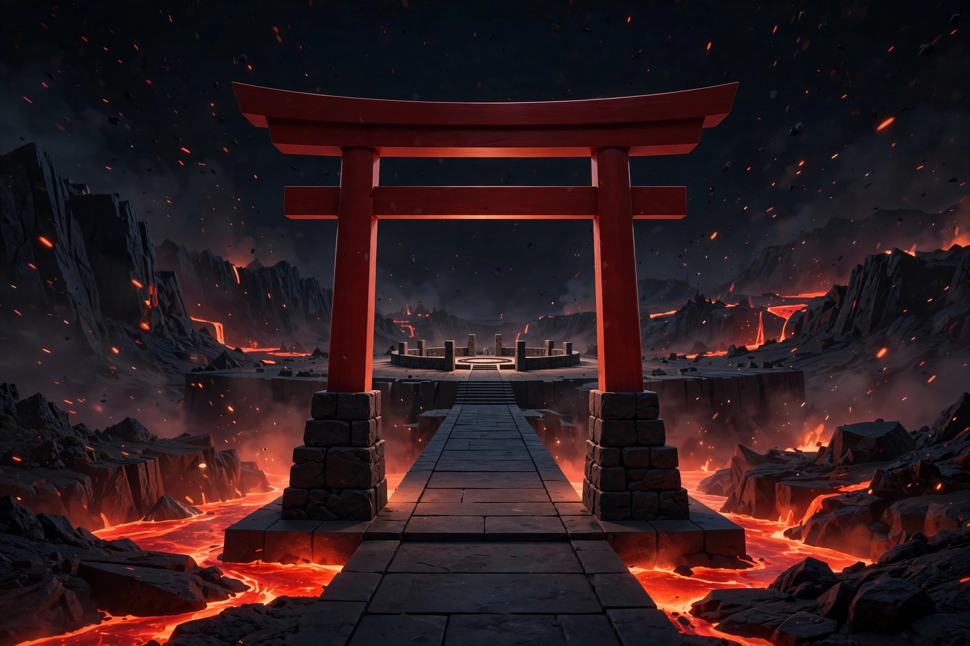
Design Notes
How this site looks, and why. Every character in this network gets a fully individualized design; this one is a lava dojo — disciplined, geometric, and restrained.
The brief
The Fire Martial Artist is not wildfire — he is the discipline of fire. So the design rejects flame-chaos aesthetics (no licking-fire backgrounds, no explosion gradients) in favor of dojo minimalism: volcanic red and black, generous negative space, sharp geometric cards, and motifs drawn from the training hall rather than the inferno.
The system
- Palette. Light theme: warm ash paper, charcoal ink, volcanic red accents, ember-orange highlights. Dark theme: near-black paper with the red turned up to a glowing ember — the arena at night.
- The brushstroke rule. Every page title carries a single red brushstroke underline: one decisive mark, like the first cut of a kata. Nothing else on the page is allowed to shout.
- The torii divider. Section breaks use a small torii-gate motif — the gate you bow to on the way in. Restraint as ornament.
- Rank-badge labels. Canon notes, signature techniques, and honesty labels are set as small square badges, like the rank patches sewn onto a training uniform.
- Typography. Heavy condensed uppercase headings with wide tracking — carved-plaque lettering — over a plain, highly readable body face. The headings give orders; the body text explains them.
Imagery
Every image on this site is AI-generated dramatization art, created in-house in 2026-09-26 and labeled as such in every caption, alt text, and the provenance record. The character's public app art was used only as a loose style reference and is never displayed raw on any public page. No real people are depicted anywhere; the character is fictional.
Honesty as a design element
The canon/fanon distinction is not buried in a footnote — it is a visible component: the bordered canon-note callout appears wherever fan worldbuilding follows canonical fact. The reader should never have to guess which is which. That, too, is discipline.